

Last Updated: November 12, 2026
Quick Summary
Colored pencil layering builds realistic texture by applying many thin, translucent strokes at light pressure instead of one heavy pass. Start with a mid-tone base, cross strokes at a 30 to 45 degree angle, and repeat 3-5 color layers before deepening shadows with a darker hue rather than heavier pressure.
- Sketch with a 2H or harder graphite pencil, then erase to a faint outline before adding color.
- Cross each new stroke layer at a 30 to 45 degree angle to the one beneath it.
- Deepen shadows with a darker hue, never with heavier pressure.
- Blend with a paper stump before adding fine detail last so strokes stay crisp.
- Blend fur only after the final stroke layer, and only in soft transition zones.
Table of Contents
- Why Colored Pencil Layering Creates Realistic Texture
- How to Layer Colored Pencils Step by Step
- Colored Pencil Blending Tools and How to Blend Easy
- How to Draw Realistic Fur With Colored Pencils
- Frequently Asked Questions
Why Colored Pencil Layering Creates Realistic Texture
Colored pencil layering builds color through many thin, translucent strokes instead of one heavy pass. Each layer sits on the paper’s tooth, and the combined layers create the depth that reads as realistic texture.
Layering is the foundation of colored pencil drawing because pigment builds gradually. Light pressure leaves the paper tooth intact so the next layer can grip; press hard on the first pass and the tooth fills up, and no color mixing later will fix it.
How to Layer Colored Pencils Step by Step
Follow this order every time. The sequence matters, because each stage depends on the paper tooth still being open.
- Sketch lightly with a hard graphite pencil (2H or harder), then erase to a faint outline; soft graphite clogs tooth before you touch color.
- Apply a base layer with light pressure in one direction, using the mid-tone.
- Add a second color at a 30 to 45 degree angle to the first so strokes cross rather than stack.
- Repeat with 3-5 color layers at light pressure; wax-based pencils hold a limited number of readable layers before the tooth fills, and that number depends on the paper.
- Deepen shadows with a darker hue, never heavier pressure, a dark green shadow on a red apple reads more realistically than a heavy red pass.
- Blend with a paper stump, then add fine detail last so detail strokes stay crisp.

Assortment of colored pencils and books.
A Practical Color-Stack Example
- Base: light yellow-green over the whole form, light pressure.
- Local color: medium red at 30 degrees to the base strokes.
- Shadow: cool violet-red or alizarin crimson on the shadow side, light pressure.
- Reflected color: a touch of warm ochre along the lower edge if the tomato sits on wood.
- Highlight: leave the paper bare or add a very light cream stroke, never white wax, which kills the tooth.
This base-shadow-reflected-highlight order works for skin, foliage, and food with only the hue choices changing.
Surface-Specific Workflows
- Fur: short strokes following growth direction; mid-tone base, then shadow strokes, then a few light highlights. Keep the pencil sharp for face detail and slightly dull for the body.
- Skin: circular strokes at very light pressure to avoid visible hatching; warm base, cool shadow, subtle reflected tone near edges.
- Wood: long directional strokes along the grain, darker in the grain lines and lighter between them.
- Metal: high-contrast layers, dark base, mid-tone, hard-edged highlight, with minimal blending.
- Foliage: short curved strokes along leaf veins, yellow-green base under a cooler green shadow.
Troubleshooting Common Layering Problems
- Muddy color: too many complementary hues or too much pressure; lift with a kneaded eraser and restart with fewer, lighter layers.
- Wax bloom (cloudy white film): wipe gently with a soft cloth; it is surface wax, not damage.
- Uneven coverage: inconsistent pressure; use a consistent light stroke and rotate the pencil slightly.
- Burnishing too early: burnishing (heavy pressure with a light pencil) must come last, or it seals the tooth.
- Paper tooth filling up: switch to a harder pencil, a lighter touch, or a paper with more tooth.
If you want pencils matched to fine detail work, see our guide to the best colored pencils for detailed coloring books.
Here is the layering sequence the article recommends, in order.
|
Step |
What to do |
Key detail |
|---|---|---|
|
1 |
Sketch lightly with hard graphite |
2H or harder, then erase to faint outline |
|
2 |
Apply base layer |
Light pressure, one direction, mid-tone |
|
3 |
Add second color |
30 to 45 degree angle to first strokes |
|
4 |
Repeat color layers |
3-5 layers at light pressure |
|
5 |
Deepen shadows |
Darker hue, never heavier pressure |
|
6 |
Blend and detail |
Paper stump first, fine detail last |
Colored Pencil Blending Tools and How to Blend Easy
Colored pencil blending tools fall into two groups: dry tools (paper stump, colorless blender pencil, soft brush) and wet tools (solvents that melt the wax binder).
For beginners, dry blending is the safer start. A paper stump smooths gradual transitions without adding pigment. A colorless blender pushes existing layers together for a smooth blend. Solvents work fast but can dull color saturation if you flood the paper.
Try this order: stump first, colorless blender second, solvent only for large areas.
How to Draw Realistic Fur With Colored Pencils
Realistic fur comes from stroke direction, not color choice. Short strokes following the animal’s growth pattern read as fur; long uniform strokes read as hair on a doll.
Build fur in three passes: a light mid-tone base, darker strokes along the shadow side, then a few light highlights.
Stroke Shape and Pressure by Texture
- Fine fur (face, ears): short tapered strokes at light pressure, pencil sharpened to a long point; strokes shorter than the width of the eye.
- Coarse fur (body, tail): slightly longer strokes at light-to-medium pressure, pencil allowed to dull; vary length so the coat does not look combed.
- Hatching (wood grain, fabric weave): parallel strokes at a consistent angle, light pressure, layered at a second angle for cross-hatching.
- Stippling (moss, stone, rough skin): small dots at varied pressure; denser dots read as shadow, sparser as highlight.
- Circular strokes (skin, soft blends): tiny overlapping circles at very light pressure to avoid visible direction lines.
Layer Order for Fur
- Base: mid-tone of the coat, light pressure, strokes following growth direction.
- Shadow: a cooler or darker version of the base on the underside and in creases.
- Reflected color: a hint of the surrounding environment (warm ground, cool sky) along the lower edge.
- Highlight: bare paper or a very light cream stroke; avoid white wax, which fills tooth.
Troubleshooting Fur
Watch out: blending fur with a paper stump too early smears strokes into a flat wash and destroys the directional read. Blend only after the final stroke layer, and only in soft transition zones.
Other common problems: strokes that look like eyelashes (too uniform), fur that reads flat (missing shadow layer), and clogged tooth (too much pressure on the base).
Practice Checkpoints
Before a full piece, run a small fur swatch and check three things: a visible value range, crisp stroke edges on the shadow side, and visible paper tooth in the highlights. If any checkpoint fails, adjust pressure or layer order.
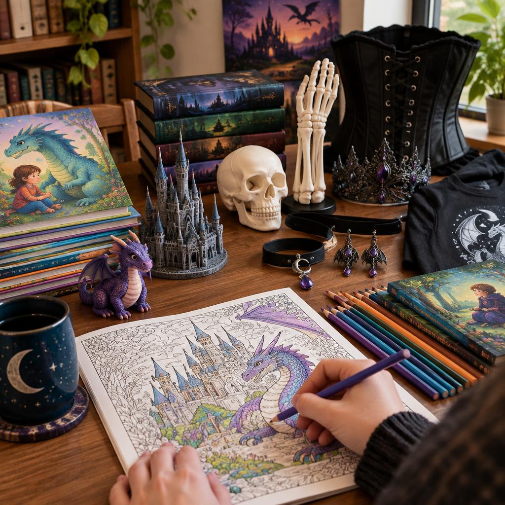
Practice on a coloring page before a full piece. Our coloring books give you reptile scales and fur to test these strokes on.
Layering rewards patience, and the payoff shows up in the first texture you finish. LumaLayer Creations publishes original coloring books and independent children’s books designed for exactly this kind of practice, alongside our original 3D-printed designs and custom apparel printing.
Frequently Asked Questions
How many layers of colored pencil should you use?
Textured papers can hold several light layers before the tooth fills up, while smoother papers tend to cap out sooner. Build gradually with light pressure and check saturation after each pass. If new strokes start sitting on top of the paper instead of sinking in, the tooth is full and it is time to stop or switch to a fresh area.
How do you blend colored pencils without losing texture?
Use directional strokes and dry blending with a paper stump rather than heavy burnishing. Keep pressure light so the paper tooth stays raised, and blend only where you want smooth transitions, such as skin or sky. Leave textured areas like fur and stone unblended so the pigment sits in the valleys and keeps its grain.
What paper is best for colored pencil layering?
Pick paper with visible tooth and enough weight to take repeated passes, such as cold-press watercolor paper or dedicated colored pencil board. Match your pencil type to it: wax-based pencils layer well on textured paper, while harder pencils suit smoother surfaces. Test a scrap first, since tooth capacity decides how many layers you can build before the surface clogs.

0 Comments