


Quick Summary
Advanced shading techniques for detailed coloring books start by identifying the light source, then building shadows in thin layers from light to dark. Mark the highlight, midtone, core shadow and reflected light on each area before applying color. Work with light pressure and blend one value step at a time.
- Mark the light direction with a small arrow in the margin before coloring.
- Apply three layers: a pale base, a medium tone, then a dark core-shadow accent.
- Use very light pressure early so the paper keeps its tooth for later layers.
- Burnish only at the end of the shading sequence, since it fills the paper’s texture.
- Leave a thin white edge on the light side of small shapes to preserve their highlight.
Table of Contents
- Start With the Light Source: Reading Shadows on a Detailed Page
- How to Shade with Colored Pencils: Layers, Pressure and Direction
- Colored Pencil Blending Techniques for Smooth Transitions
- Shading Small Spaces in Coloring Books Without Losing Detail
- Choosing Your Next Coloring Book to Practice These Techniques
- Frequently Asked Questions
Advanced Shading Techniques: Light and Depth in Detailed Coloring
Last Updated: November 11, 2026
Start With the Light Source: Reading Shadows on a Detailed Page
Advanced shading techniques for detailed coloring books start with one question: where is the light coming from? Most shading problems come from skipping this step. Pick a light source before you touch a pencil, and every shadow you add afterward will look like it belongs.

Look at any object on the page and find the brightest spot. That is your highlight. The area directly opposite is the core shadow, the darkest part of the form. Everything between them is the midtone.
- Highlight: the brightest area, where light hits most directly
- Midtone: the transition zone, where color looks most true
- Core shadow: the darkest area, opposite the light
- Reflected light: a faint glow in the shadow, bounced back from nearby surfaces
Mark the light direction with a tiny arrow in the margin. You will refer back to it often.
How to Shade with Colored Pencils: Layers, Pressure and Direction
Colored pencil shading works best in thin layers, not heavy pressure. Start light, build slowly, and stop before the paper looks waxy. A good shading technique for detailed coloring books is to apply three layers: a pale base, a medium tone, and a dark accent in the core shadow.
Keep your strokes in one direction within each area. Diagonal strokes that follow the shape of the form look smoother than scribbles. Lighten your pressure as you move toward the highlight so the paper shows through.
Watch out: pressing hard early on fills the paper’s tooth and makes later layers impossible to blend. Build light first.
|
Step |
Pressure |
Purpose |
|---|---|---|
|
Base layer |
Very light |
Sets the overall color |
|
Midtone layer |
Light to medium |
Defines the form |
|
Shadow layer |
Medium |
Adds depth in core shadows |
|
Highlight |
Erase or leave white |
Creates brightness |
Colored Pencil Blending Techniques for Smooth Transitions
Blending turns harsh pencil marks into soft gradients, but the outcome depends less on the blending tool than on how much tooth the paper still has when you start. Paper tooth is the raised texture of the surface that holds pigment. Every layer you add fills some of those valleys, and once they are full, the next layer sits on top of the wax instead of gripping the paper. That is why blending problems often look like a tool problem when they are really a surface problem.
The first technique is layering, which means building overlapping passes of two or three hues so they mix on the paper. Work from the lightest tone outward. Each pass should be lighter in pressure than the one before it, so the tooth stays open for the next color. A common pattern is to stop when you can still see faint texture under your strokes, because that texture is what lets the next layer grab.
Burnishing is the second technique. Press firmly with a light-colored or colorless pencil over darker layers to compress the pigment and smooth the surface. It produces the glossy finish many detailed-page artists want, but it fills the tooth in one pass. Use it at the end of a shading sequence, not in the middle, or the remaining layers will skid and skip.
Wax-based and oil-based pencils respond differently on the same paper. Wax-based pencils lay down thicker pigment and sit on the surface more, so they tend to show a waxy sheen earlier when burnished. Oil-based pencils penetrate and blend more readily, which allows more layers before the tooth fills. If your book’s paper is smooth, expect to reach the waxy stage after fewer passes, and reduce pressure accordingly.
Solvents and colorless blenders can soften transitions, but they also dissolve some of the texture you built. Apply them to a small test area in the same book first, let them dry fully, and then judge the result under your light-source arrow. Use the smallest amount that closes the gap between two tones.
For smooth transitions, move through the value scale one step at a time. Skipping a tone leaves a visible band where two colors meet, and no amount of burnishing will fully hide it.
Watch out: if a burnished area goes shiny and then rejects new pigment, you have overfilled the tooth. Stop adding layers there and shade the neighboring area instead.
Shading Small Spaces in Coloring Books Without Losing Detail
Small areas such as eyes, leaf tips, and narrow gaps are where detail is most often lost, and the cause is usually a lighting decision rather than a hand-control problem. A small shape still has a light side and a shadow side, and the shadow must be placed according to the same source you mapped for the whole page. When the core shadow of a tiny leaf tip is painted without reference to the overall source, it reads as a smudge.
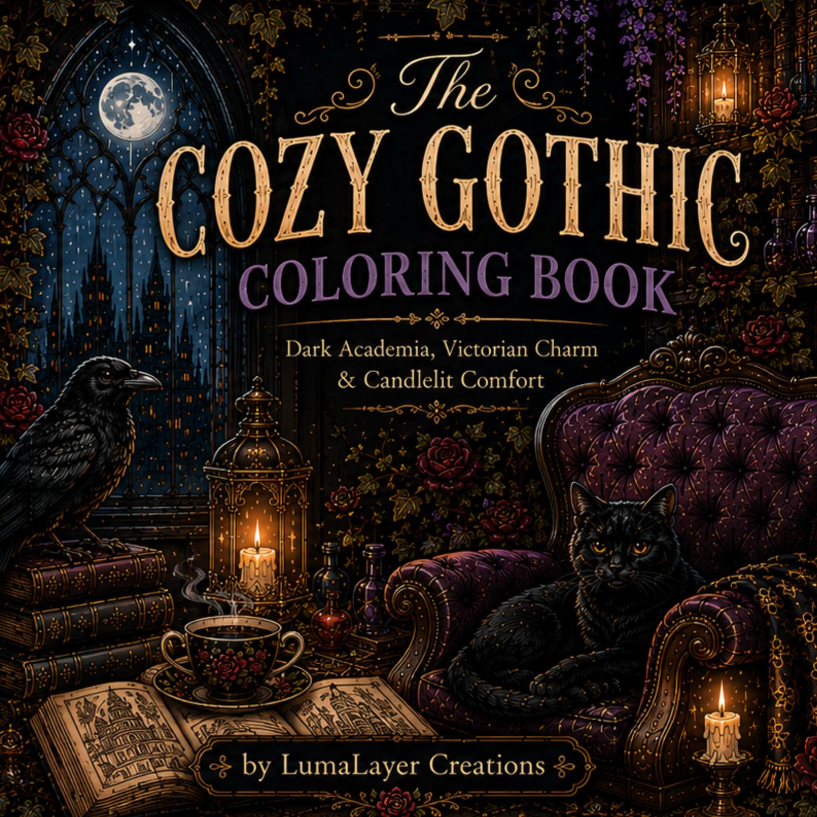
For organic subjects, map the light source across the main masses before you touch any small element. On a flower, for example, identify which petals face the light, which curve away, and where the center casts shadow onto the petals beneath it. Mark these in the margin with small notes. On a face, the brow, the side of the nose, and the underside of the chin are the primary shadow planes, and the eye sits inside that structure rather than apart from it.
Work inside that map with short, controlled strokes, never wide sweeps. Sharpen the pencil before each small section so the stroke stays within the line. Use one or two layers at most in tiny areas, because each extra layer widens the mark and can fill the detail you are trying to preserve.
Leave a thin white edge along the side facing the light. This preserves a highlight that a small shape cannot afford to lose, and it gives the eye a clear reading of the form. If a highlight is too small to hold, a narrow edge of paper left untouched accomplishes the same thing.
Keep the darkest value for the smallest shape only if the light map places it in a core shadow. Otherwise, let the surrounding larger areas carry the darkest tone so the small element stays subordinate. Step back every few minutes and check the whole page, because small areas that look right up close often clash at normal viewing distance.
Watch out: a core shadow that crosses a printed line will break the form on every neighboring area, so re-check the border before adding the final layer.
Choosing Your Next Coloring Book to Practice These Techniques
The best practice book has clear line work and enough open space for layering. Books with large, detailed scenes let you test light sources across many shapes. Simpler designs help you master one technique before moving on.
If you want a book that rewards careful shading, look for whimsical forest animals with textured fur or feathers. These subjects show how light moves across rounded forms. Our guide to colored pencils for detailed coloring books can help you pick the right tools to match your practice book. If you want to take your shading beyond the page, Custom apparel printing and 3d printing are services that can bring your finished designs into other forms.
For a wider view of your options, see an overview of adult coloring book styles before you buy. Start with one page, apply one technique, and compare the result to your light-source arrow. Practice on the same subject several times, and you will see your shadows become more controlled and believable.
Frequently Asked Questions
How do you shade small areas in a detailed coloring book?
Work with a sharp pencil point and reduce pressure as you move toward the edge of each small area. Build value in light layers, starting with the lightest tone in the shadow zone and adding darker layers only where the light source suggests the deepest shadow. Keep strokes short and follow the form of the shape, such as curving with a petal or leaf, so the shading reads as dimension rather than flat fill. Stop before the shadow reaches the outline to preserve crisp linework.
What is the best way to blend colored pencils in intricate designs?
Layer two or three colors that sit near each other on the color wheel, then use a light touch with a colorless blender or a lighter pencil of the same hue to soften the transition. Burnishing, which means pressing firmly with a pale wax-based pencil over the layers, creates a smoother surface in larger areas. In tight spaces, skip heavy burnishing, since it can fill in fine details and obscure the linework that gives the design its character.
How do you choose a light source when shading a coloring page?
Pick one direction before you start, such as upper left, and keep it consistent across the whole page. Look at where the design’s large shapes would catch light and where they would fall into shadow. Place highlights on the side facing the light and core shadows on the opposite side, then add a soft reflected light along the shadow edge to suggest a rounded surface. Consistency matters more than realism, because mixed light sources make a page look confused.
How can you make colored pencil coloring look more realistic?
Realism comes mostly from a clear value range rather than from color alone. Include a true light area, a midtone and a dark core shadow, and keep the transitions between them gradual. Vary your pencil pressure so some areas are lighter and grainier, and add small, darker accents near contact points where one form meets another. Test your value scale on scrap paper before working on the finished page.

0 Comments